the bad thing about the template of this blog is that i hate things written with white fonts on a black background. i have always hated them, they're tiring and hard to handle, and they remind me of a quote saying that if this was the normal and easy way for written stuff, The New York Times would have probably used it instead of the classical, yet useful regular black fonts on white background manner (i think Ogilvy said it, of course i modified it a lot, cause i really cannot remember the original version). So why on earth did i choose it in the first place? Beats me, probably because i do like black a lot, and i didn't like the other templates anyway. And now i am pretty much afraid to change it because of some nasty related experiences with blogger.
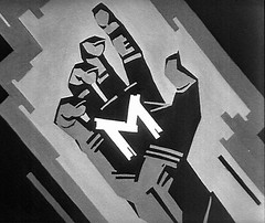
in the mean time however, Alex decided it was time for me to have a better-looking header, and sent me these options to choose from. Obviously, i couldn't decide, so i thought i'd just post them here, and in case anybody wants to express an opinion or something, please feel free.
I think the first one is too blurry for my tastes, the second one gives me the impression of bar-codes, the third one makes me think about Sherlock Holmes (especially since this morning i watched a Tweety&Granny episode with an extravagant millionaire who gathered the world's biggest detectives, and trapped them in a room, forcing them to try to solve a mysterious murder, which wasn't even a murder after all; anyway...) and the last one is very simple and reminds me of computers and stuff. However, I'm just not sure whether i should actually have a better-looking header in the first place.
I think the first one is too blurry for my tastes, the second one gives me the impression of bar-codes, the third one makes me think about Sherlock Holmes (especially since this morning i watched a Tweety&Granny episode with an extravagant millionaire who gathered the world's biggest detectives, and trapped them in a room, forcing them to try to solve a mysterious murder, which wasn't even a murder after all; anyway...) and the last one is very simple and reminds me of computers and stuff. However, I'm just not sure whether i should actually have a better-looking header in the first place.


7 comments:
you should send me a better brief, then - never have you mentioned these concerns to me..
hey! i didn't send any brief at all !! :))
and they're not concerns; they're just thoughts :) - for example, i'm crazy about the holmes resemblance :)
maybe the second or the third one for visual reasons and also i believe the second is more serious and the bar-codes impression does make you think shopping, consumer, stuff like that and the third is just cute like you:)...so indeed you need to make a brief for a header to represent the blog. ...cause a refreshed header does not sound bad at all, i think. :)
thanks, cris !
question: wasn't turning "a tribute to claudiu" into "no case too big, no clue too small, no solution too outrageous" enough for the header's refreshment ? :))
I'd stick to the fourth sample. It matches the idea of the text itself.
dig more holes!
the 4th one is nice tough. could I send in a variant too? O:-)
of course, ago! please do :)
Post a Comment